On the web there are cycles, almost organic, which regularly renew the digital universe, sweeping away outdated items and replacing them with exciting news: new technologies, new apps, new companies, new devices, new looks.
The aesthetic cycle of web design is approximately two years: one year new trends emerge and first adopters start to implement them; the following year they consolidate and go mainstream. At this point every site starts to look the same and the innovators begin to come out with new ideas to stand out from the crowd.
2015 brought us flat design, hero scenes, full-width mega sliders and the prevalence of sober newspaper-style graphics. By now every agency, every company with a decent online presence has those, it really feels like we need something fresh.
If among your resolutions for 2017 is to redo the look of your site, you cannot ignore these new web design trends to show that you always have a head start on the competition.
1) Large text, bold… huge
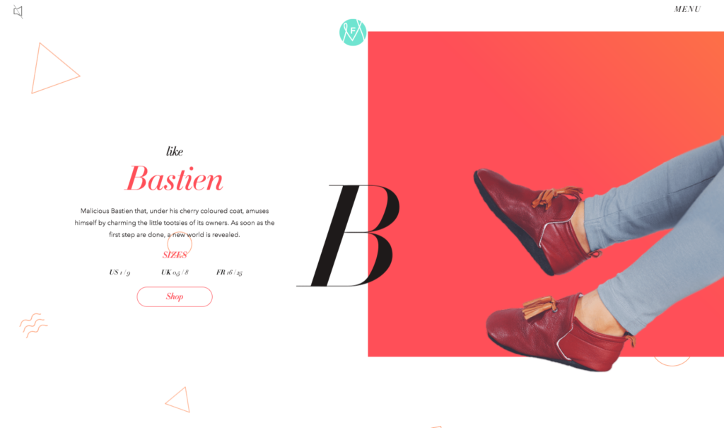
Typefaces are a great way to organize the contents of the site. Use them! Since content is and will remain king on the web and it is getting longer, large typefaces are useful to highlight the main concepts and associate them with an emotion, which as we know is the fastest carrier of meaning. Organize a visual hierarchy of meaning by using titles, subtitles, quotes, phrases out, it helps readers to browse and remember the content, not to mention they are oh so very SEO-friendly! Last but not least large typefaces are easier to read on mobile devices which is where most of the action is.
2) Hand-Drawn Elements and illustration
It might be a reaction to the hyper-technical quality of the web and to the linearity of flat design, but after the boom of brush fonts , other visual elements follow the same road to a more natural, organic look. You can find several examples of this trend on Man Repeller which often uses original illustrations of different styles for its articles.
DSW banner, it’s also a GIF (see below)
3) Gradients
In recent years the only shades we talked about were mostly gray, but the aesthetic influence of popular photo filters seems to have spread beyond the confines of the visual mobile apps into general imagery. On the most popular sites used among web designers, for example Behance and Envato, one can immediately notice the popularity of gradients in the Top Rated / most downloaded works, often superimposed on photos bitonal
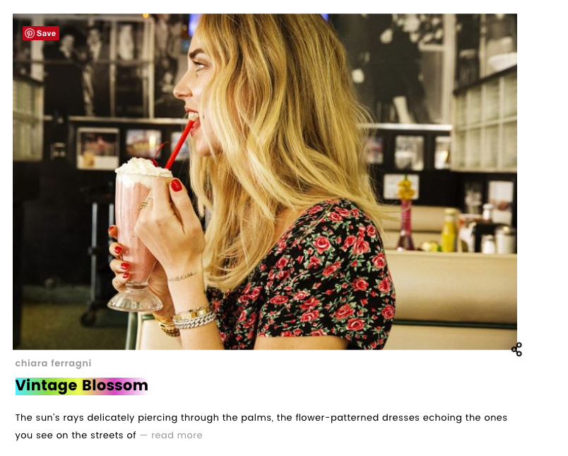
Even Chiara Ferragni’s blog “The Blond Salad”, always very observant of web design trends, has already incorporated gradients in its graphics!
4) Animations and gifs
I’m not talking about cartoons, but short animations and movements on the page, for example over the recent Holiday season we have seen many WordPress blogs with a delightful “snow effect” that it was very atmosphere without disturbing the use of content.
According to the principles of Material Design expounded by Google in 2014 (and definitely a recommended reading for anybody who is serious about web design) movement provides meaning, but not only. Animations break the monotony of the page and provide points where the user can focus her attention.
I’m happy to see GIFs coming back, they were on the rise about 5 years ago but then they lost popularity. By bridging motion and still imagery, GIFs are an ideal expressive shorthand to convey meaning and emotion in a light format.
5) Color! Lots of it!
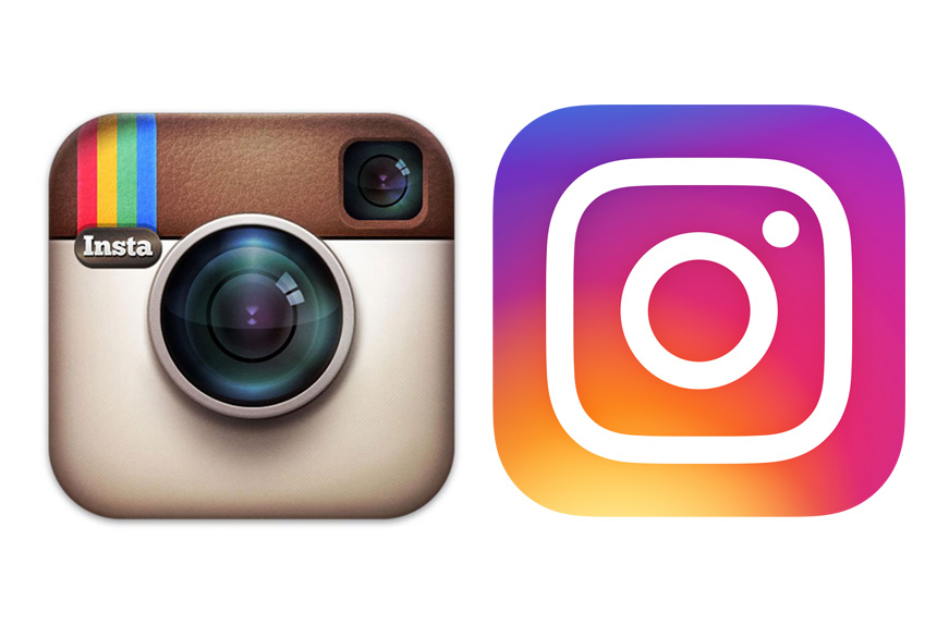
With the advent of mobile many designers chose simplicity and sobriety to maintain readability on small screens. For a few years now one of the most popular looks for blogs has been the black and white newspaper. I cannot say how many times I have seen the Simple Mag theme in the last few years. Don’t get me wrong, it is still an elegant and versatile theme for any blog, if obvious. After sobriety color is making a come back, an example for all: the change of Instagram logo and all its sister apps. from vintage-y, retro look in pastel colors to full-on saturated colors (and gradient too). In particular, the same color palette orange-to-purple of the new Instagram logo seems to be very popular lately.
Color is useful for emphasizing certain elements and spice, and then make more pleasant a page. .
6) Simplified Menu
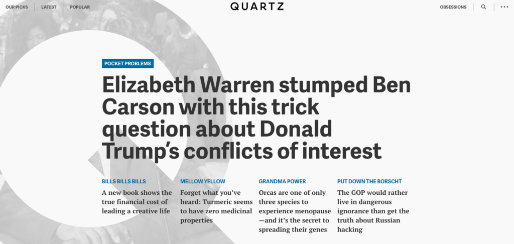
The average number of menu items is decreasing driven by the need of easier navigation for mobile devices. If a few years ago the rule was 5-7 items, now even the most complex sites should aim to link 3 max. 5 items on the main navigation menu. News site Quartz is a great example of how optimize complex menus to maximize UX: our pick, latest and popular are an excellent guide to choice.
7) Grids
I’m a big fan of grids. They allow to present the content on the page clearly and to adapt it to different screen sizes seamlessly. This is an area where many web design developers seem to be focusing: building grids easier to manage and customize and especially lighter in terms of bytes.
On WordPress there are already several plugins, such as Visual Composer, that make easy breezy creating grids in several formats (i.e: masonry, regular grid, for pictures, for posts etc..).
8) Scrolling effects
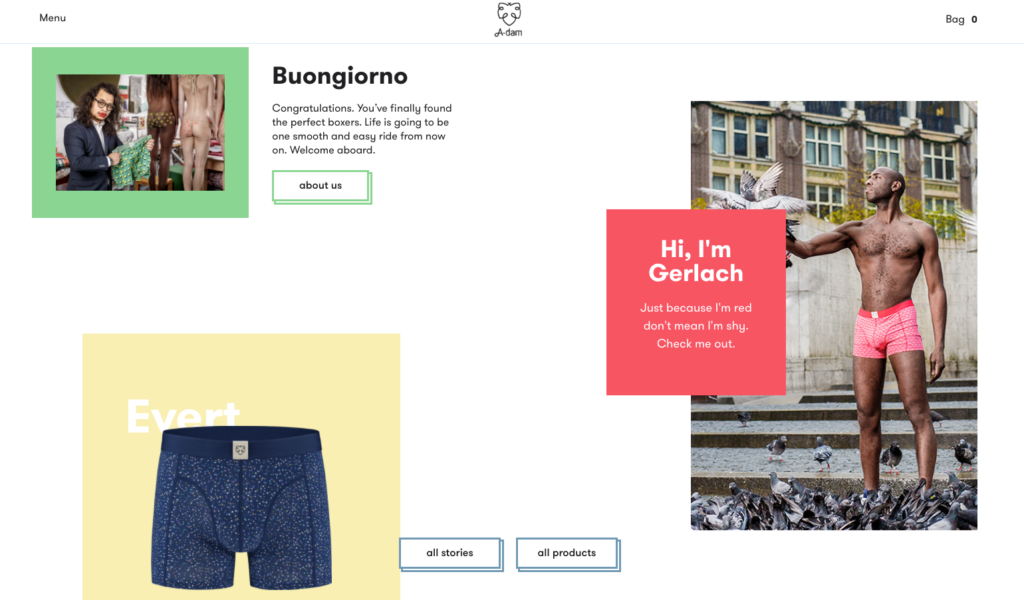
Yet another consequence of smartphone supremacy, scrolling is now an established gesture for the navigation of any website, even on desktop. For this reason, it’s time to go beyond simple scrolling and get creative with it. This seems a favorite playground of designers who are coming up with plenty of unique effects for scrolling.
Here are some of my favorites:
Adamunderwear.com (which also gets an award for the sense of humor!)
9) Microinteractions
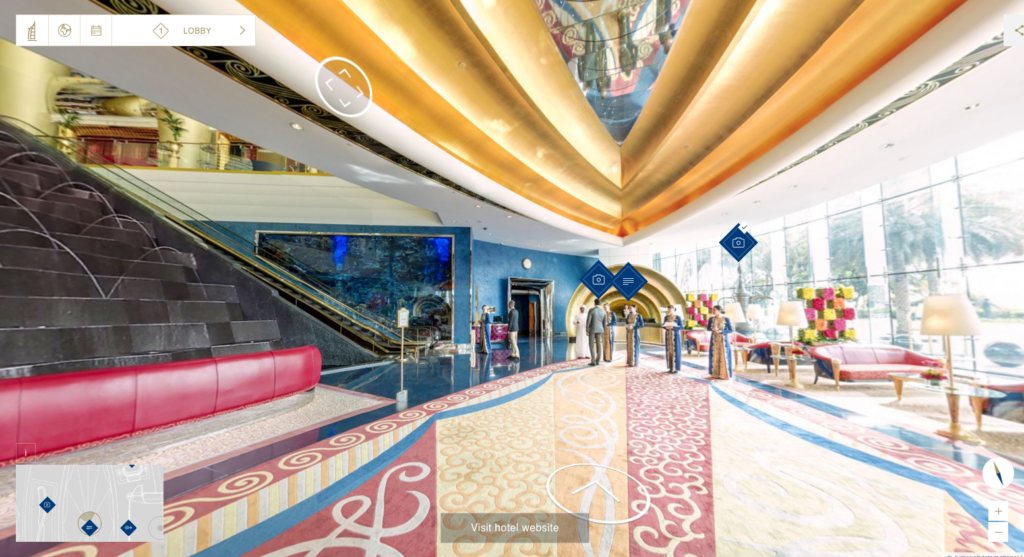
Yes, I saved the best for last. This is the buzzword that you will be hearing a lot from your creative design teams for the next 12 months, at least. Micro-interactions are all subtle, minimal ways that the website reacts to actions on the page. Dear old hover is the precursor , while the above scrolling effects are part of the latest generation of micro-interactions. But the king of this game is the changing perspective, especially the 360 degrees view which mimics the VR experience. Facebook has already implemented in 2016 with its 360 degrees and panoramic photography.
An example for all, the amazing, and informative, 360º navigation menu of the Jumeirah Hotels website.
So now you understand why I’m excited… and why I need to get down to study how to implement some of these new trends on my sites!
Wishing you a happy and esthetically delightful 2017!
PS: By the way did you hover on the opening image?
