New-agey supermarkets like Wholefoods and Trader’s Joe have been wreaking havoc on the NYC supermarket scene in the last few years. Their clean efficient stores piled up with organic foods and healthy choices, often less expensive that the corn-syrup laden foods on the dusty aisles of their competitors, have been conquering the Big Apple neighborhood by neighborhood, with a strategy worthy of Alexander the Great. Just 10 days ago Fairway, the NY answer to Wholefoods, has announced its bankruptcy, Metromarket down the street closed last year as did the Food Emporium up the street, but the lights at my local DagNYC supermarket are still on, while it braves the wave of new supermarkets with its regular weekly circulars.
This week, however, I was in for a surprise as DAGNYC has come out with their new advertising campaign. Nothing too fancy, of course, just photos of people interacting with food used on the circulars and store posters. The thing that struck me though, is that most of these images are unsettling, wrong, if not downright repellent.
Here are a few examples from this week’s campaign:
1 Cholesterol bonanza
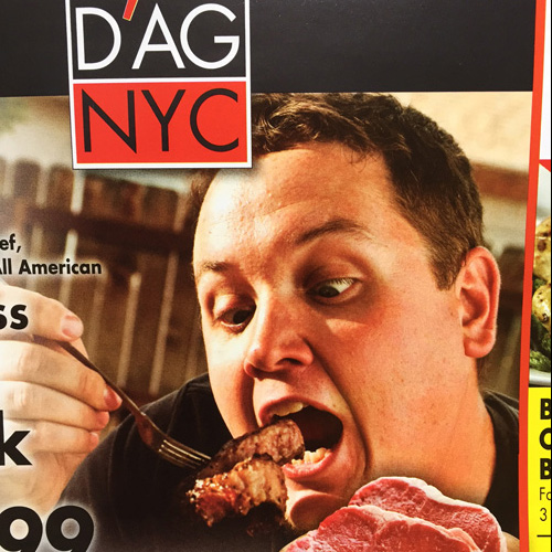
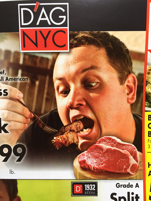
The puffy man eating a steak on this week’s circular cover is definitely suicidal, he looks like his cholesterol has hit 300 a while ago, but the eyes clearly say he cannot control his cravings, Dr Phil please intervention
2 Tantrum chicken
The kid eating fried chicken is clearly throwing a tantrum, and of course any mom doing the shopping will be oh so happy to buy him just that chicken.
3 Lucretia’s sushi
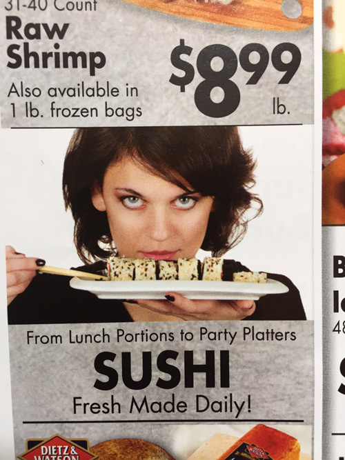
The beautiful dark hair lady with ice-blue eyes looking over sushi has the appeal of a modern day Lucretia Borgia. First thing to come to my mind: poisonous level of mercury in fish or some freaky bacteria from raw fish. Thanks but, I don’t think I’ll get close to that sushi for now.
4 The leaning tower of meats
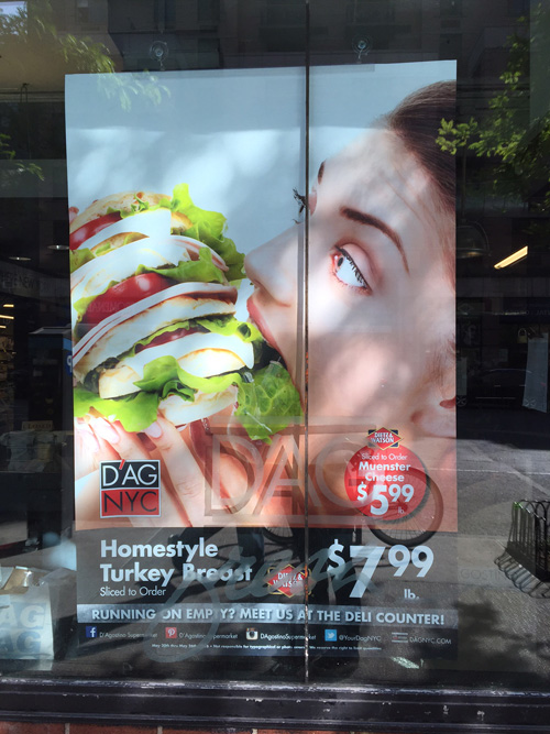
Shall we talk about the decadent “so pile-up-it-s-unbiteable” turkey sandwich? Clearly nobody can tackle it and maintain a shred of decorum, is this supposed to be funny? To make me hungry? I can see it falling down, and you know mom thought me I shouldn’t eat stuff picked up from the floor.
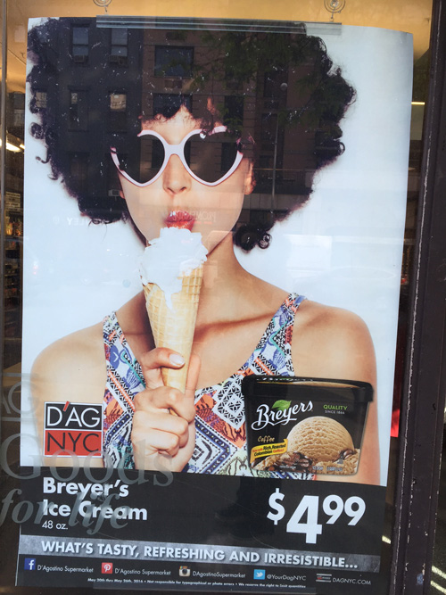
5 Afro Wig Lolita
Finally, this whitey-whitey girl with afro wig and sexually suggestive ice-cream is certainly going to go down well with the ethnic sensitivities awakened by the racial tensions of the last 2 years. And, by the way, you can be sure that her cheap top will be noticed by my fashionista neighbors.
Ad-people out there, advertising pundits everywhere, please help me! Help me to make sense of this repellent food advertising campaign: am I too conservative? am I too serious, boring, depressing, without a shred of humour…? What kind of customer do you think they are trying to reach? As it is, I can see it appealing just to sociopaths or people with some serious eating disorders.
Or is it just the old trick of the controversial campaign? If this is the case, I hope that with this post I’ve opened the controversy and it will blow up and out, and soon I will have back the reassuringly moot still-life of shiny fruits and veggies, bloody steaks and plump chicken that there used to be, if not I have to conclude that the bosses at DagNYC are feeling just like the guy with the steak above.
